- text and edit by
- Satoko Yokota
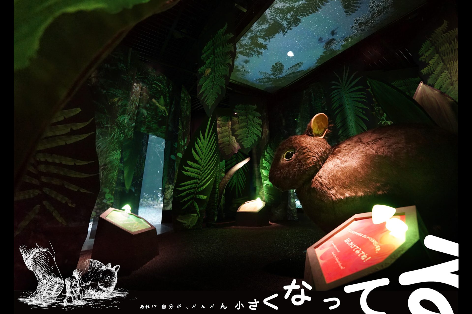
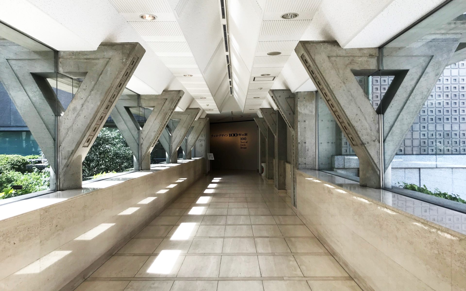
The other day, I went to see the exhibition "100 Years of Czech Design" being held at the Setagaya Art Museum. Along with the European design movement that began with the Art Nouveau movement at the end of the 19th century, this impressive exhibition features a wide range of unique designs from the Czech Republic (Czechoslovakia until 1993), including furniture, graphics, and animation. It is (Exhibition information is listed at the end)


Among them, the most eye-catching design is the “typography” that decorates posters and book covers.
A printing and design term that generally refers to the arrangement of type. The choice of typeface, layout, and other expressions and structures of printed characters are, in modern times, the design and design of typefaces (typesetting), and design by all printing methods.
(From Britannica International Encyclopedia Subsection Encyclopedia)
An important element that makes up typography is the "typeface = font". I think that many people imagine Mincho and Gothic typefaces in Japanese, but did you know that there are similar types of European typefaces?
serif and sans serif
The oldest European typeface is the serif type, which is recorded as stone carving in ancient Rome. A "serif" is a letter with a stroke at the end. It has a classical impression and is perfect for creating a dignified image.

On the other hand, "sans-serif" means "no serif" (san), and gives a clean and modern impression without small protrusions in the details of the letters.

The difference between the two typefaces is similar to the Japanese typefaces Mincho and Gothic. You can see that changing the typeface gives a completely different impression, even when conveying the same thing.

Fonts that create a brand image
The typeface "FUTURA", which is said to have been particularly popular in the Czech Republic, was created by Paul Renner, a part-time lecturer at the Bauhaus in Germany in 1923, based on geometric forms (almost perfect circles, triangles, and squares). Developed and announced based on As the name means "future", it is still used in various places even after more than 90 years.
For example, Louis Vuitton's logo and IKEA used it as a unified font for everything from advertisements to stores until 2009, and Volkswagen always uses it for advertisements. It is also used in the title and credits of Stanley Kubrick's movie 2001: A Space Odyssey, which gives a sense of the future.
You can see that adopting a font that truly symbolizes the "future" leads to enhancing the brand image of companies and works. In other words, it is not only a formative design such as a logo, but also a uniform font is an important element that leads to the creation of a unique image = branding.
Choosing fonts with a story
In addition to spatial design and construction work, we also provide total branding services, including naming, logo development, and visual identity development related to the space. At that time, we have specified "recommended fonts" in the manual because we want you to use uniform fonts for all media including sign design.
When choosing fonts, I value the story behind them. Fonts are selected depending on whether the background of the company or project emphasizes tradition and history, whether it is an advanced image, or whether it is a fusion of tradition and the future. Sometimes I create original typefaces.
We planners often compete with proposals composed of words and images, but we try to change the font according to the content of the plan. The world view of the font also creates the image of the proposal.
There are many fonts around you. If you look a little closer and observe, you'll have fun meeting various fonts!
Exhibition overview
Date: September 14th (Sat) to November 10th (Sun), 2019
Opening hours: 10:00-18:00 (Admission until 17:30)
Closed: Mondays (open if Monday is a public holiday, but closed the following weekday) Open on November 4th (Mon/substitute holiday) and closed on November 5th (Tuesday).
Venue: Setagaya Art Museum 1st floor exhibition room
Organized by: Setagaya Art Museum (Setagaya Cultural Foundation), Czech National Museum of Crafts in Prague
Supported by Embassy of the Czech Republic, Czech Center Tokyo, Setagaya City, Setagaya City Board of Education
Sponsor: Lufthansa Cargo AG
Grant: Nomura Foundation
Planning cooperation: IDEF Co., Ltd.
*please note*
The information on exhibitions and linked websites in this article is current as of the time this page was created.
Please note that it is subject to change.
Like this article?
- editor
-

-
nomlog editor-in-chief
Connecting Planner|Planning across Areas