[khb East Japan Broadcasting × NOMURA Co., Ltd. IVD] Change, connection with the region, and the future--What are the thoughts put into the new CI?
2022/04/28- text and edit by
- nomlog editorial department
September 30, 2021. khb East Japan Broadcasting, a TV station in Miyagi Prefecture affiliated with TV Asahi, has moved to a new building, and a new CI (corporate identity) has been formulated accordingly.
Fujie Suzuki, art director of IVD (Integrated Visual Design), a professional team of visual and graphic design at NOMURA Co., Ltd., is in charge of the formulation and branding of this new CI and the spatial design of the entrance on the first floor of the new building. (Introduction to IVD can be found here)
One day in December 2021, about two and a half months after moving to the new building. Suzuki visited Sendai and talked with the project team of khb East Japan Broadcasting, which was in charge of the relocation of the new office building and the formulation of the new CI.
Why was NOMURA Co., Ltd. IVD commissioned to formulate the new CI?
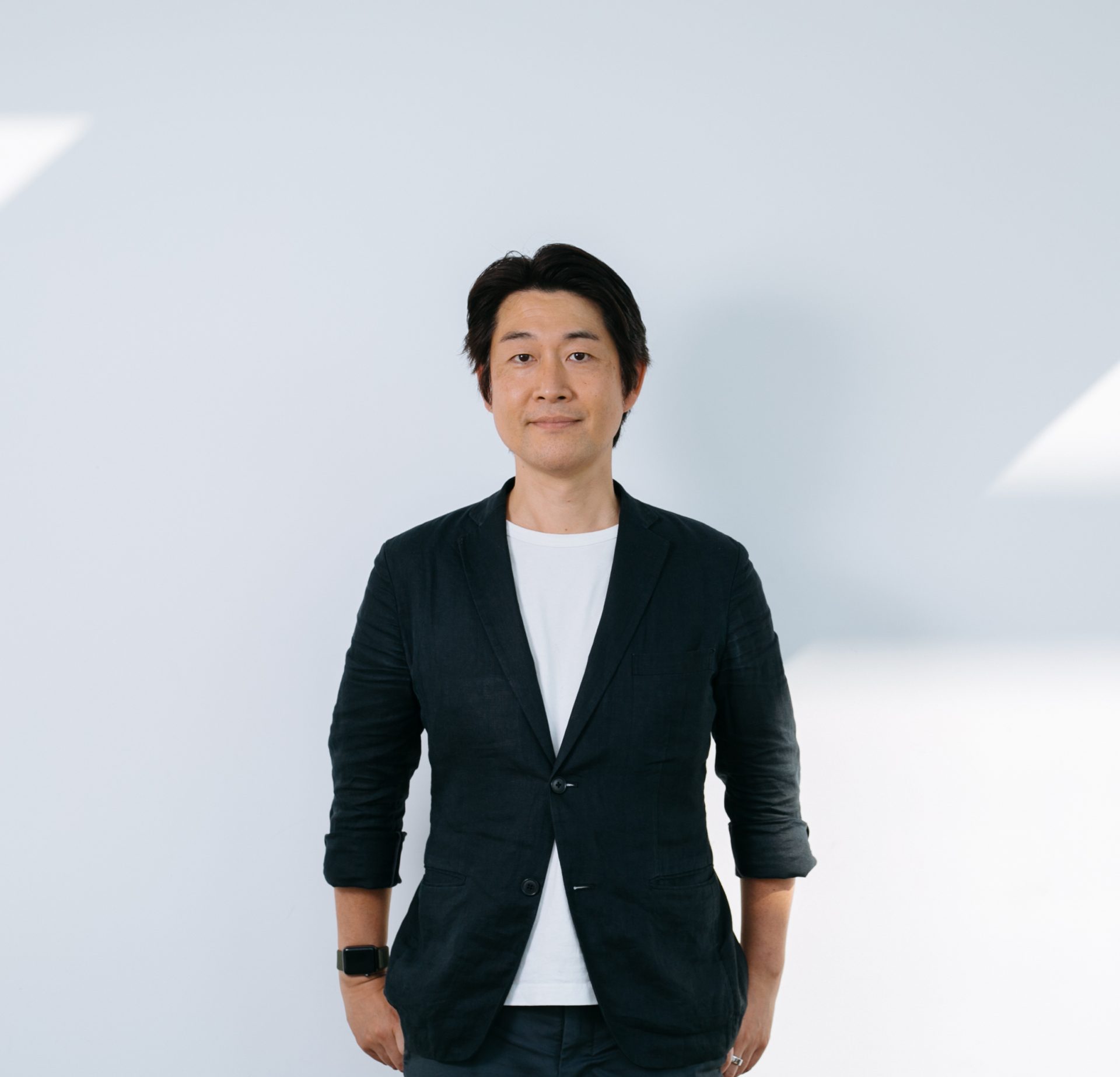
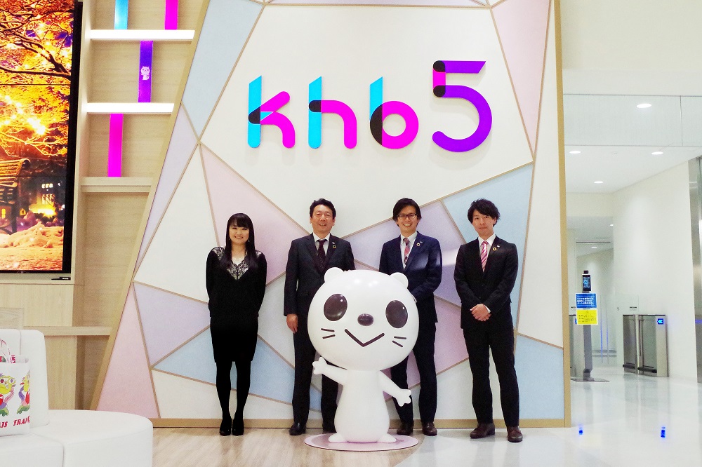
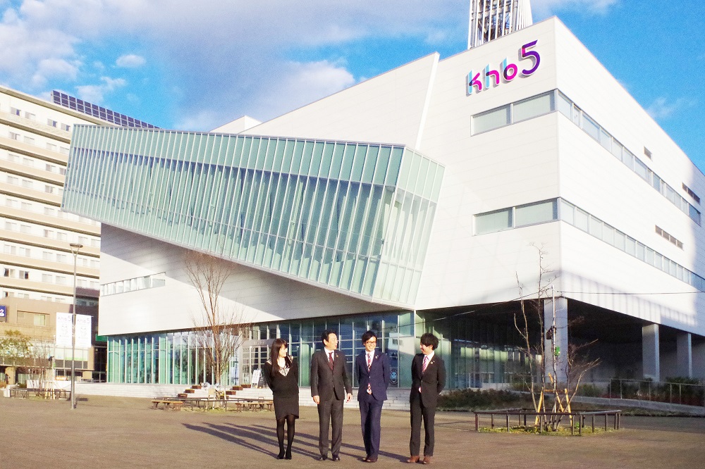
 From the left, NOMURA Co., Ltd. IVD Fujie Suzuki, khb director new office building project manager Tooki Kato, new office building project office/deputy manager Norio Shimizu, new office building project office Hidehito Shiga
*Affiliations and titles are those at the time of the interview.
――First of all, please introduce yourself.
Kato
"My name is Toko Kato, director of the new company building project department."
Shimizu
“My name is Norio Shimizu, the deputy general manager of the new company building project office.
Shiga
“I am Hidehito Shiga from the new office building project office. khb has an organization called Mirai Project, which is made up of young employees from each department, and I am also the leader of that organization. I was the one who interacted the most with Fujie-san, I think.”
――I heard that the new CI was decided centering on the future project.
Kato
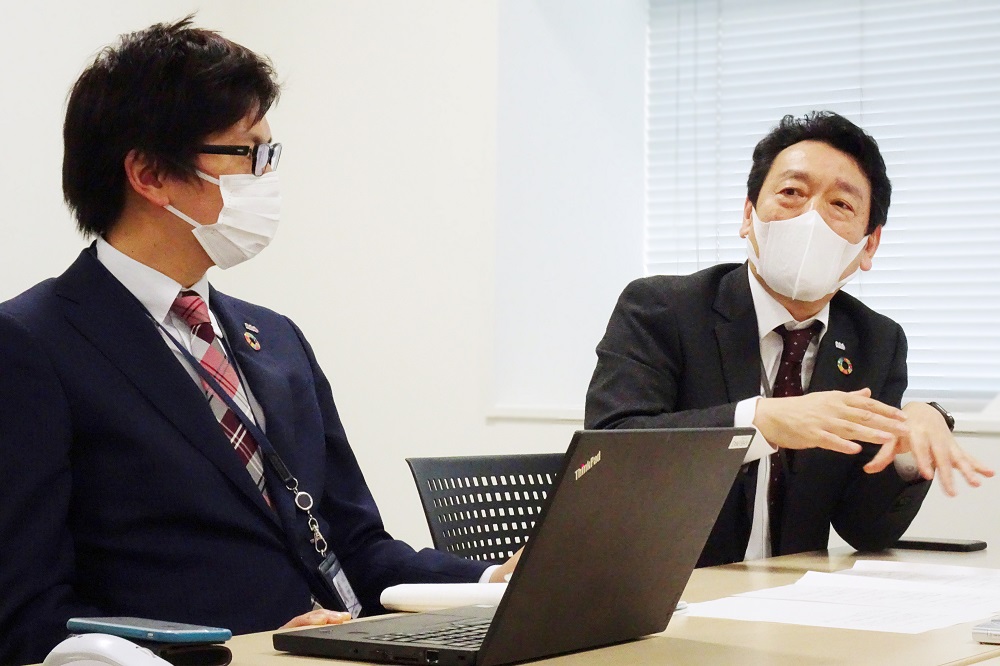
“If we don’t let the young people who will carry the company on their shoulders make decisions, it will tend to be plain when the old men decide (laughs). No, seriously, the management will decide If that happens, the company as a whole won't be able to get excited... It's good to have a format that reflects the opinions of everyone (employees). It's been a long time since I've talked about it. In that case, I thought that I should have him do it in the future project."
Shimizu
“The hardest thing to do when making big changes is deciding how to decide. We only have one chance.In that case, we should incorporate the fresh and flexible ideas of young people who have been with the company for a long time.We want to break through the shell without being confined to the current framework. I wanted to value the opinions of young people, and I also wanted to create a corporate culture in which young people would come up with various proposals and ideas."
--At the timing of the move to the new building, the CI from the opening of the station in 1974 will also be changed. Was that the plan from the beginning?
Shiga
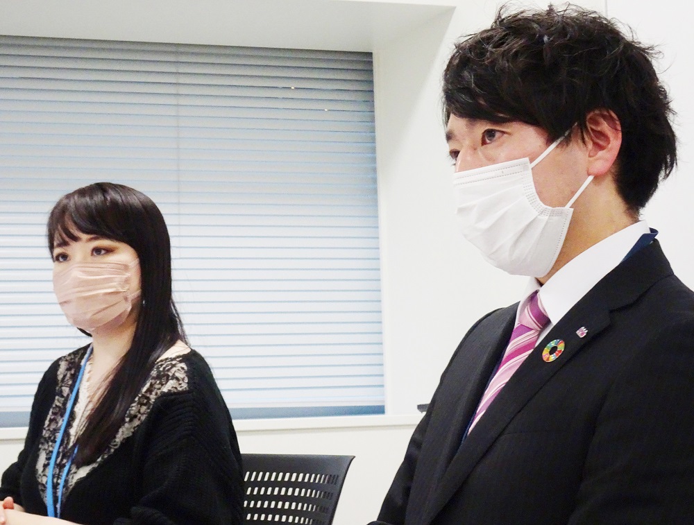
“When it was decided that we would move to the new building, we created an opinion box, something like a guideline. There were many opinions, so we decided to change the CI.”
Shimizu
“I found that employees of various generations unexpectedly recognized this as an issue because of opinions such as things like the corporate colors being inconsistent. Nie's name was also on the list, and since then I've felt that 'Nomura doesn't just make visual proposals, he always unearths the story that accompanies them.' That's what I think is really cool, and I really wanted to think about the new CI together."
Kato
"Yes, at first, I think it was like, 'Is it possible for Nomura to do CI design and branding?' I'm sure there was a feeling that
Fujie Suzuki
“Thank you very much.
Shiga
"I made a formal request, and in the first presentation, I think you submitted more than 15 design proposals."
Fujie Suzuki
"Yes, here is what I proposed at that time."
Kato
"That's right, this, this. It's already nostalgic."
 Many design proposals proposed by Fujie Suzuki in the first presentation
What was important was "sharing words"
――How did you feel when you first saw the proposal?
Shiga
"At first, they didn't even tell us how many designs they would propose (laughs). I was wondering what they would look like, but they kept suggesting all sorts of different patterns, and I was surprised, thinking, 'So many!?' What's more, each logo had a story based on the words we had shared in advance about the relocation and new CI, such as 'reborn anew,' 'unity with the community,' 'attachment,' and 'spirit of challenge,' and Fujie carefully explained each one to me. At that moment, I truly felt that I was glad I had asked Nomura to help me."
Fujie Suzuki
“Thank you very much. I place great importance on ``sharing words'' in any job. I heard a lot about your thoughts on CI and your passion for what you want to be like in the future.At the first logo presentation, you also brought a document summarizing those 'words'."
Shiga
"That's right. The material was very easy to understand, and the story behind the proposal was all convincing, so I was really at a loss as to which one to choose from over 15 different proposals. Based on what we have accumulated so far, we have narrowed it down to six proposals.”
Kato
“I showed the management six proposals, and I asked Fujie-san to explain the design one by one.”
Shiga
“In the end, we narrowed it down to two proposals, and then we chose the current new logo.”
Kato
“The other plan is also good, isn’t it?

Fujie Suzuki
“When I heard about CI, the first thing that popped into my mind was the image of Guri (khb image character) in the number 5. 'What channel is it? So, if it's going to be new, I'd like to appeal to 5."
Shiga
“In the end, a design that was different from Fujie’s first image was chosen, but we asked him to create a design with the number 5 in the decided logo.”
Kato
“We want to show that khb has 5 channels. This feeling was strong among our employees. We also received opinions from the Public Relations Department.
What did khb East Japan Broadcasting Corporation feel while spending time together with Fujie Suzuki?
――Was there a plan to refine Guriri from the beginning?
Shimizu
"No, actually, that was Fujie-san's suggestion."
Kato
“He made a proposal at the stage before I asked him. When I saw the refined Guriri, it seemed to match the new logo. I once again felt that 'I have no choice but to do this,' so I immediately consulted with the president, and he said, 'Maybe it's okay.' All the young people said they wanted to do it."
Shiga
“The members of the Mirai Project have a good reputation for the cuteness of the refined Guriri. Refine is also particular about our channel “5”. The shape of the tail and the neck are tilted “5” degrees. When I introduce the story to people who have come to tour the new building, they listen with interest and say, 'Oh, that's right.'
――I heard that you were very particular about the color this time.
Fujie Suzuki
"Yes. I thought that color was a key point in formulating this CI."
Shiga
“Until now, the khb logo used red, green, and dark blue.
Fujie Suzuki
"When I asked about the story in advance, there were many opinions that they wanted to give an image of ``khb, this is it.'' Therefore, I want to create something that will impress viewers and local people. In the future, for example, even if there is no khb notation or logo there, just looking at the color will make you feel khb. I took the plunge and made a proposal that incorporated three colors, pink, blue, and purple, as our corporate colors.
Also, taking advantage of the characteristics of a TV station, I wondered if I could challenge RGB colors, so I explained it at the time of the first presentation. When viewing on a monitor or screen, I thought that setting colors unique to RGB, which has a wide color gamut, would bring out more individuality.”
Kato
“Honestly, even though management didn’t go as far as resisting the use of color, there was a sense of ‘Is it really okay?’ There were many opinions that it might be possible to show that

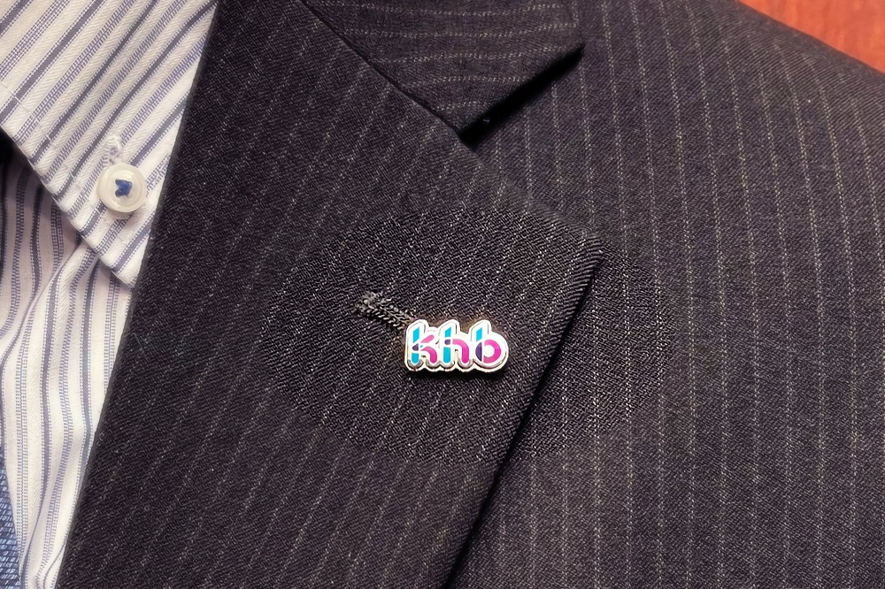
 New logo designed by Fujie Suzuki (top) and refined Guriri (bottom)
Shimizu
“It’s a lot different from what we’ve done so far, and it’s become very colorful. As we were progressing, there was a concern that in the end we would end up choosing something that would be safe. At the moment this was chosen, I was very happy because I could feel the company's direction, or rather the strong will to aim for something that had never existed before. , There are pros and cons.Even so, as a company, we chose this new design.You can feel the determination and thoughts of the company there, and I think that it will surely be conveyed to employees even if it is not put into words. I think it had that kind of effect.”
Shiga
"It's not just a logo design, but in terms of expressing the identity of a company when considered as a CI, it shows positivity and the attitude that we can change just by looking at the logo. Very nice logo, corporate I think it may have turned into color."
Kato
"Also, the material that Fujie made that compared the logos of the TV Asahi affiliated stations. It was very easy to understand! If you put the existing logos of each station and the new logo of khb side by side, it will look like this. When I had them lined up, I felt that the new logo stands out overwhelmingly among the stations.It was easy to make a decision.”
Shimizu
"Even if we didn't ask you to, you would research the logos of stations all over the country by yourself. You would visit all the TV stations in Sendai and even take pictures to create easy-to-understand materials. That kind of inconvenience. We also sympathized with Nie's enthusiasm.We were very happy to see each and every one of the minds about this work."
Fujie Suzuki
“Thank you.
Kato
"There are so-called 'jobs that are made to do' in the world, aren't there? It's a job that makes you feel like you're doing it because it's work. But Mr. Fujie's work is just like that. It's on a different level.Even if I didn't ask, he actively thought about things like ``things that would benefit khb'' and ``things that would be better to do'', and he suggested them to me.Fuji Mr. E’s work was a series of such proposals.”
Fujie Suzuki
“One of the things that we were able to understand and proceed with was this Guriri maquette*. When we thought that we would develop not only two-dimensional objects but also three-dimensional objects in future public relations strategies and goods production, we decided to develop a guideline. I thought it would be better to have something like that, so I proposed it.In fact, I was happy when it was used in the monument production for the special program commemorating the relocation of the new company building.”
* Maquette originally means "model". When creating three-dimensional objects (monuments, figures, stuffed animals, etc.), using the maquette as a three-dimensional index makes it possible to bring consistency and a sense of unity to the form of each product.
Shiga
"The merchandise proposals were also amazing. All of the merchandise you suggested were visualized, so it was easy to get an image of them. Thanks to that, I realized that there are many possibilities for what can be done in 3D. I thought it would be better to make a maquette.By the way, when I was in the production stage of the stuffed animal, it was quite difficult to check back on the data, so the production company asked me to draw the position of the eyes and mouth on the sample with a magic marker. ’, but Fujie-san made each part out of felt and positioned them, and it was a very meticulous job.”
Fujie Suzuki
"I couldn't put a pen in the face of Guriri, who was full of love (laughs)."
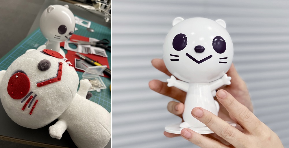 Based on the maquette (right), detailed checks were repeated to improve the degree of perfection of the three-dimensional Guriri.
After relocating to the new office building and formulating a new CI, my thoughts and future
――Now that you have completed the new office building project and the new CI, can you tell us anything you noticed?
Shiga
"I learned a lot, I can say this. As Kato said earlier, work is no good if you just do what you are asked to do and end up doing what you are asked to do. It's important to do things voluntarily and gain trust through that accumulation.Of course, that attitude is common not only in this work, but in all work.As long as I'm working as a leader of young people, from now on I became strongly aware that I had to actively show that side of myself.”
Shimizu
“There is a gap between professional creators and us who place orders, and while we fully understand the importance of the stories and concepts that we just talked about, there are also people who are unable to convey them. There are a lot of them, and honestly I think most people don't know about them.In the end, it's the logo that catches the eye, and there's also the idea that what matters is the shape, color, and impact of the final output. For those who ask for a design for the first time, I feel that there are difficulties and difficulties in understanding such areas.
This time, I clearly communicated this to Fujie-san at the beginning. On the other hand, Mr. Fujie has a well-balanced understanding, creating a story from future projects, opinion boxes, latent needs that emerged from conversations with us, and underlying thoughts for the future. , gave shape while permeating the surroundings. Would you say that you filled this gap through the CI formulation and design process?
So even if we didn't hold a workshop just to create CI, I'm glad that we were able to give shape to what we've been doing naturally within the company."
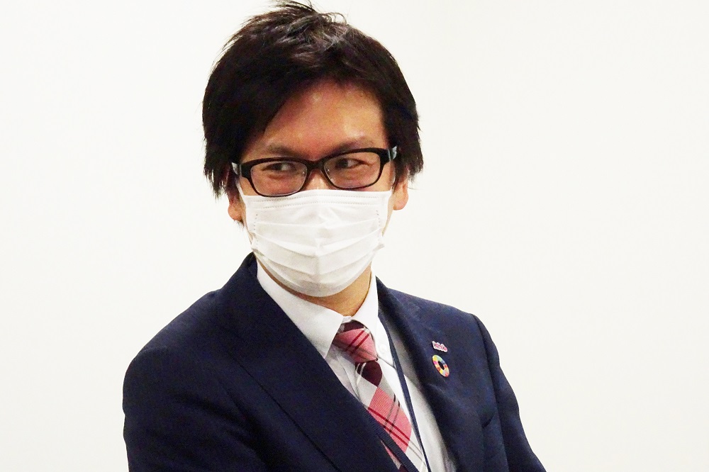
――What Mr. Shimizu just said might serve as a reference for other companies. If there is a mechanism that can collect various voices, including latent opinions, the formulation of CI and its subsequent development will go well. I hear that some companies have turned the workshop itself into a purpose.
Shimizu
"That's right. This time, in the process of moving to the new building, we developed CI and various designs while linking well with what we had done so far, so the axis did not waver throughout the project. That's why the world view of CI I think I was able to express it with the main entrance and the pictogram.”
Fujie Suzuki
“From a branding point of view, I also think that the new building should have a sense of unity in the so-called VI (visual identity), such as CI, space, various tools and applications, so I am happy to hear that.
In addition to giving shape to the client's thoughts and requests, I am always conscious of valuing the client's customer, and from my standpoint, the customer behind it in the same way as the client. increase. With my own approach while sharing feelings with the client.
I always think that people who do creative work have something like "a desire to achieve". I always want to incorporate it into my design and create something that will become a memory from memory.
This time, we have proposed each and every one of them, such as new guriri, pictograms that make you smile when you see them, color bars that impress the entrance, hidden guriri and shining guriri in the bar, cafe barista guriri, and goods. I hope that the people who visit the khb building will be remembered and like khb. The children who visit will grow up with those memories and become adults... I wish I could be an opportunity to create such warm and fun memories. I designed it with that in mind.”
Kato
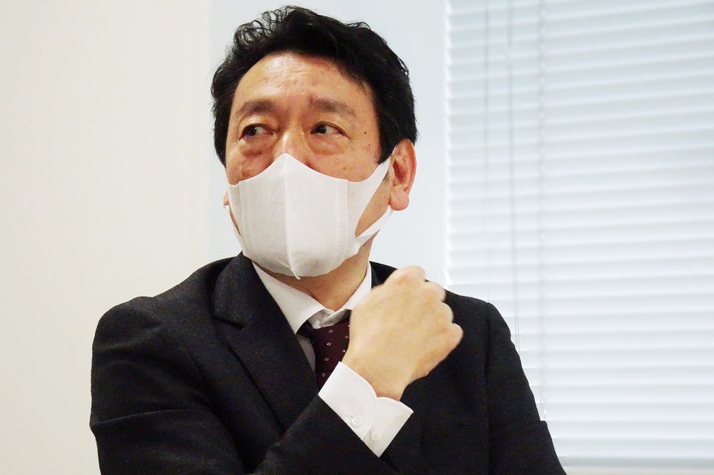
“When I worked with him on this project, I felt that Fujie-san is not only an excellent creator, but she is also a person who is easy to work with. Even if you make a proposal based on an order from our side, people will say, "That's a bit too much." But Fujie-san is very appropriate."
Fujie Suzuki
"I'm happy thank you"
Kato
“He is sensitive to the keywords and hints that come out during various exchanges of opinions, and is extremely good at incorporating them into the design. In fact, there were times when I didn't remember saying anything, but he said, ``Mr. I thought it was amazing because he input what he felt."
Fujie Suzuki
“When I first heard your story, I felt that you were a somewhat modest and sincere company. ``I want to support that feeling!'' I thought that was my mission.
――Did you notice any changes in the people around you, including employees, viewers, and everyone in the community, as a result of the CI that was formulated in that way?
Shiga
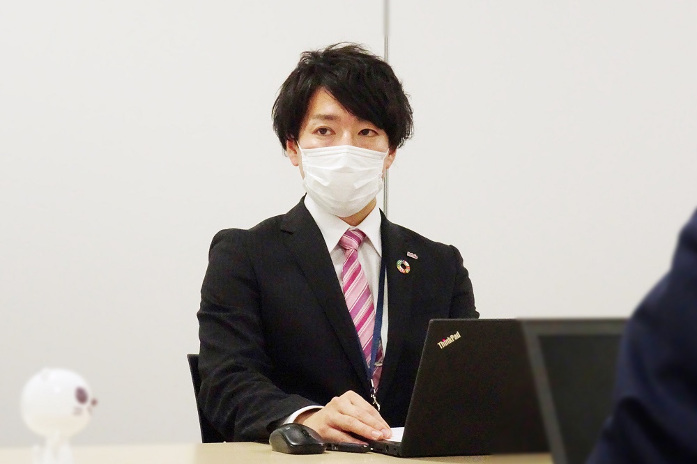
“I have had many opportunities to talk with young employees, and they have been very positive, including the refinement. I feel that it is becoming more and more.That's why I think the power of design is amazing.That's why I have more attachment to this corporate color than anyone else, and when I create company materials I don't think I'll ever use anything other than this color (laughs)."
Kato
“Yes, I personally didn’t like wearing the company emblem until now, but now I am happy to wear the new one. I have a very strong feeling that I want many people to see it. When I wear my company emblem and employee ID card after moving, people in the area ask me, "Are you from khb?" I will.
Also, now that TV is said to be tough, I don't know if it's because of the new CI, but khb has relatively good ratings. I feel that this is the result of conveying the message that ``khb is changing.'' It is also gaining more attention as a whole. Despite the number of YouTube channel registrations and the enrichment of content, it has gone from being the lowest by far to the number one commercial broadcaster.”
Shimizu
“After we moved, we held a tour of the new office building for viewers. We had about 1,300 people see the logo and entrance, and their impression was very positive, soft, and friendly. There are many.I feel that soft colors convey the message that ``We care about the people of the community.''In that sense, I feel that logos and colors are important. In particular, the logo has a feminine aspect.We also wanted to target women and young family members more and strengthen it.We didn't tell Fujie about this properly. But it matched naturally."

Fujie Suzuki
“Thank you very much. What was important to me was that I wanted the viewers and the people of the town where I moved to be familiar, and I wanted to get closer to them. While expressing the attitude of continuing to challenge the future with the sharp edges, we tried to express "peace of mind" and "friendliness" by making the overall rounded form. Also, until now it was KHB in capital letters, but I designed it with khb in lowercase letters to give it a softer impression.”
――You were very excited on Twitter, too. Before the logo announcement, various things were expected, and the logo was uploaded immediately after the announcement. In addition, the local shopping street was attaching a flag using Guriri. You can see how the locals have been looking forward to it.
 Deepen ties with the local community with a new logo and a flag using Guriri
Kato
"It was a really welcoming atmosphere. There were a lot of people who were looking forward to it. Mr. Shimizu mentioned a tour of the new company building earlier, but there were more than three times as many applications as we expected. Attention. I felt that there was a degree."
――I also heard that you would like to cherish the connection with everyone in the city and region.
Shimizu
"We also built a company building here, so it's not the end, but khb will be the engine and blend well with the old shopping district and the new development area, so that you can say 'This area is nice.' I would like to work together with everyone in the community to create a city that is more meaningful.I would like to do everything from branding for khb with CI as the starting point to branding for this area.”
Kato
“I was conscious of the perspective of urban development from the architectural planning stage.In front of me is a forest square where events can be held. We made it possible to hold an event.We asked local people to come together and interact with khb, and we asked them to design an entrance space with a CI worldview that is different from a formal business space. world"
Shimizu
“At first, the café wasn’t in the form it is today, but the Guriri you suggested was so good that we started talking about collaborating.
Kato
"Yeah, right. Fujie-san wanted to do the Guriri Café as well, so that's why I asked her to do it. I always appealed to her with an atmosphere of 'I want you to let me do it' (laughs)."
 Guriri Café serves as an opportunity to deepen ties with the local community
――Finally, how do you want khb to grow with the new CI and logo towards the future?
Kato
“It became a wonderful CI that all the employees liked, so they are proud to wear the company emblem.It is also a symbol that khb has changed. I would like to become a station that is loved by the people of the prefecture by challenging various things without stopping.I would like to be able to think of the khb logo when I think of Sendai.Also, from the Shinkansen and conventional lines The logo of the new company building and the logo of the Guriri Sports Plaza have become very conspicuous, so I expect that recognition will continue to increase in the future.”
Shiga
“I think that colors such as blue, purple, and pink are characteristic, so I hope that when you see these three colors, you will think of khb. There are these three colors, and I thought, ``Oh, it's khb.'' Even when you're not watching TV like that, I'd be happy if you could somehow come to remember khb. I also like the line, and I hope that even if you just see the line without the company name or logo, you can imagine khb.”
Fujie Suzuki
"Thank you. Employees, as well as viewers and locals, wherever they find these colors, lines, and guriri, they feel 'khb!' I designed it with the idea that I want people to remember that, so I'm happy to hear that.
Well, actually, there is something I wanted to show you today. I made a brand movie (opening video) for your company. If you don't mind, would you like to watch it with me now?"
After that, everyone watched a brand movie made by Suzuki, and the conversation ended with excitement about future khb brand strategies and new development plans for Guriri. It seems that the work of khb East Japan Broadcasting and Suzuki is not over, and will continue in some form. The members of nomlog editorial department who felt such a lingering feeling left the city of Sendai while praying for new developments.
Like this article?
